The brief
Lumen Labs is a Singapore-based experiential design studio that creates immersive installations, interactive spaces and digital experiences. The identity had to feel precise enough for technology, expressive enough for art and at home in architecture. The guiding idea came from the studio’s own tagline, “Where Ideas Take Shape.”
From architecture to a symbol
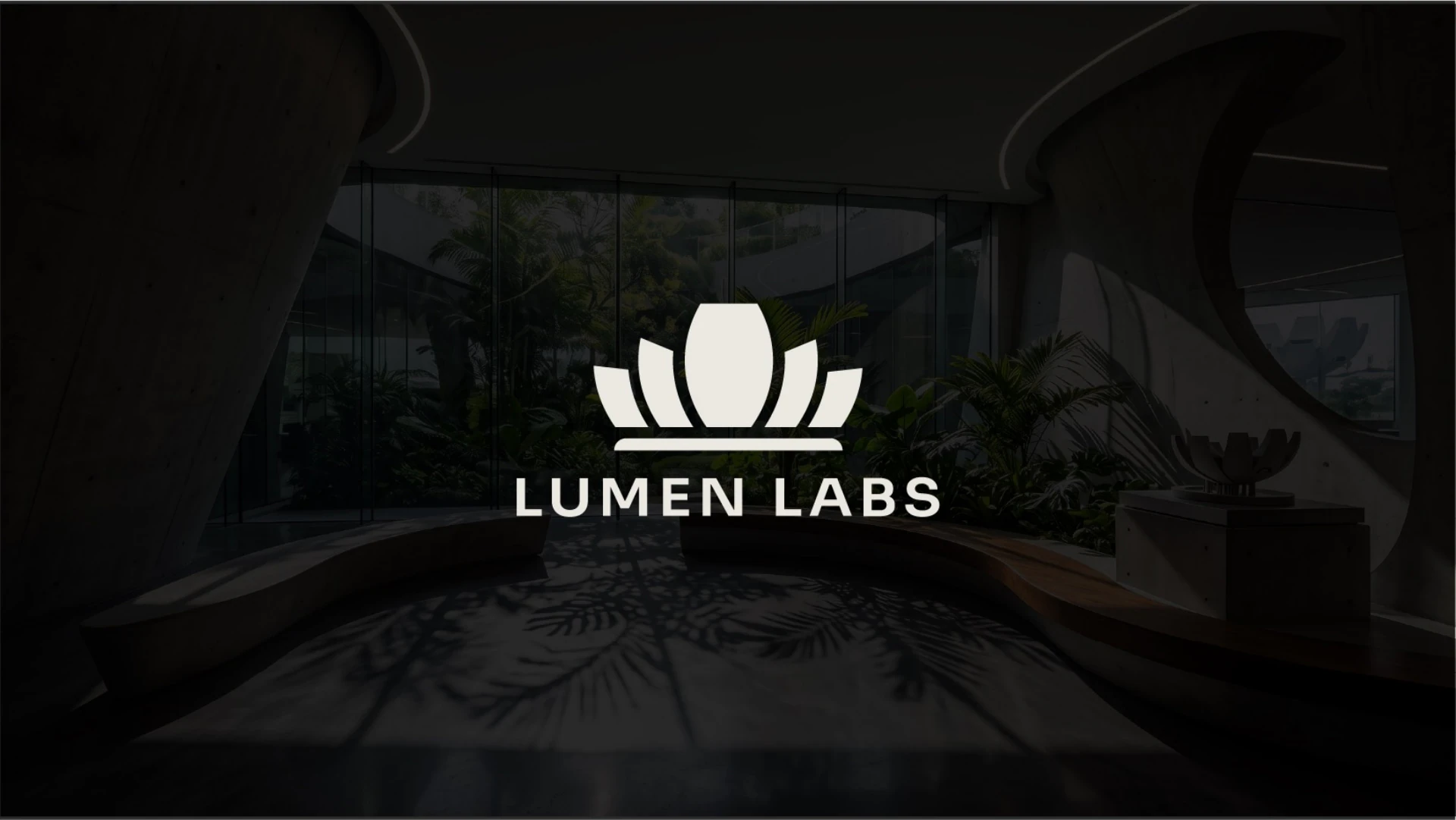
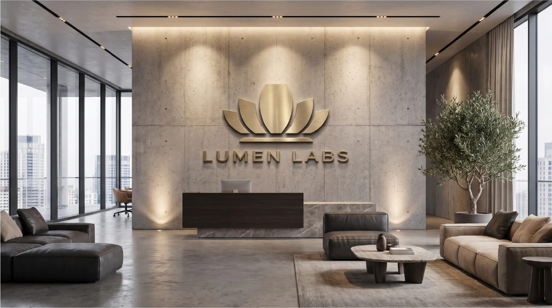
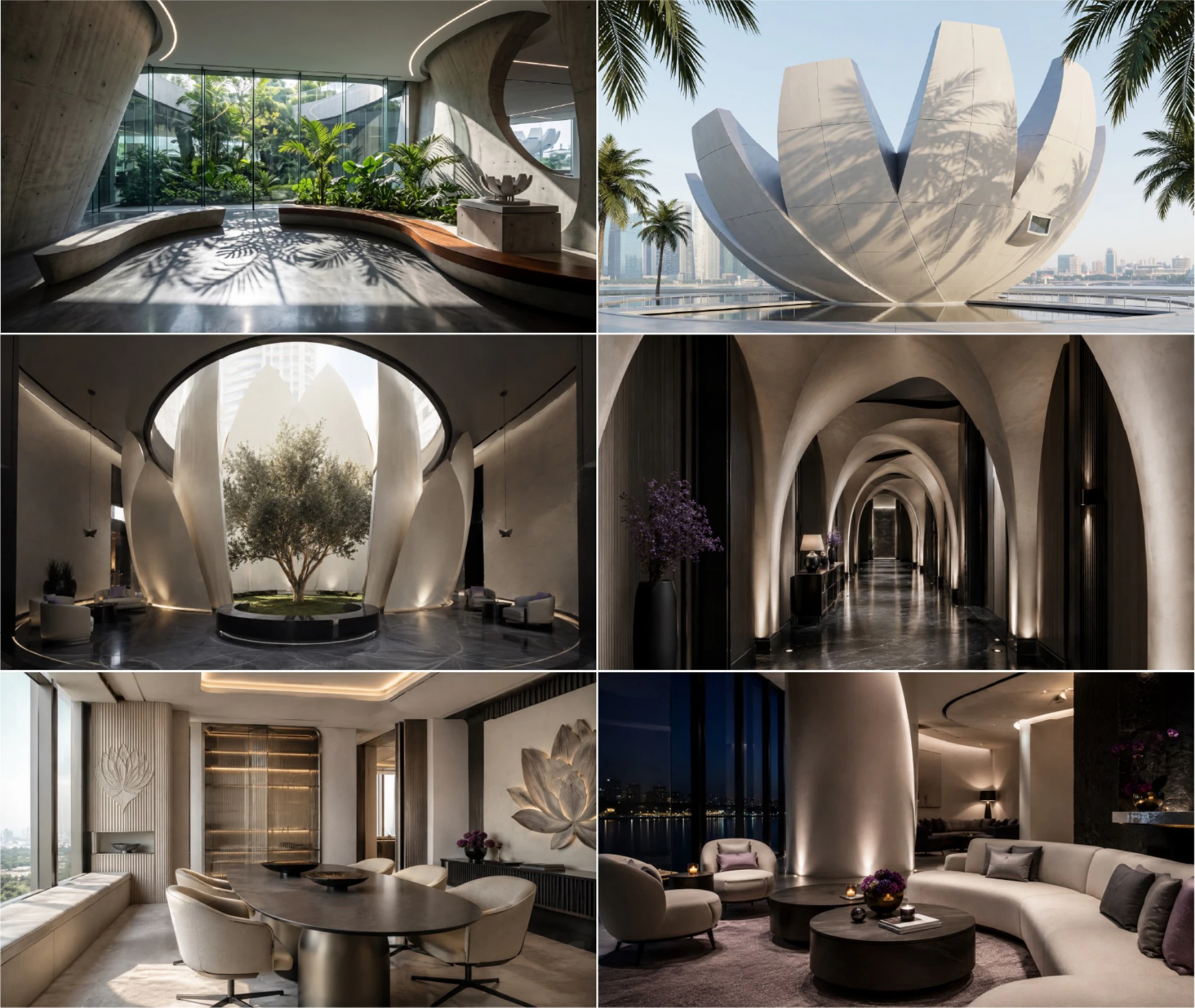
I looked at how the lotus-like forms of Singapore’s ArtScience Museum open outward. I kept that movement and stripped away the building’s details so the mark could stay clear at a small size. The outer shapes suggest unfolding petals, the central form gives the eye a focal point, and the horizontal base anchors the composition. The silhouette carries the idea on its own, even in a single color.
A system for print, screens and spaces
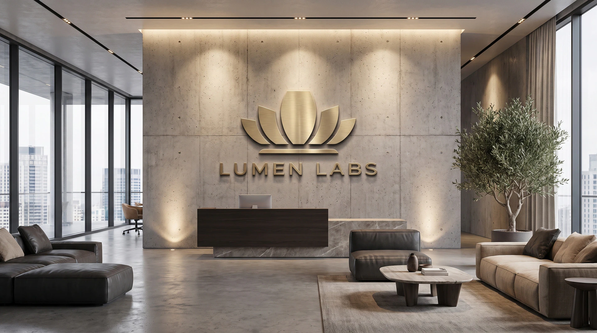
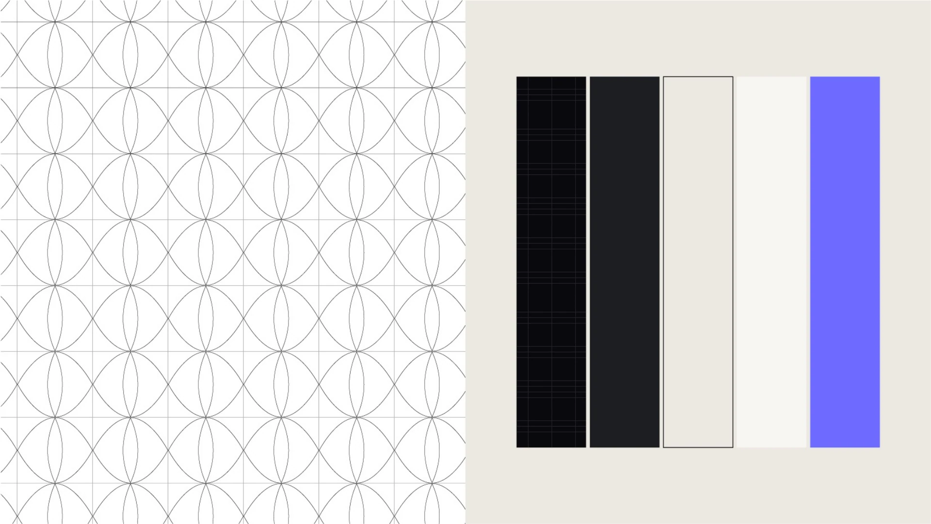
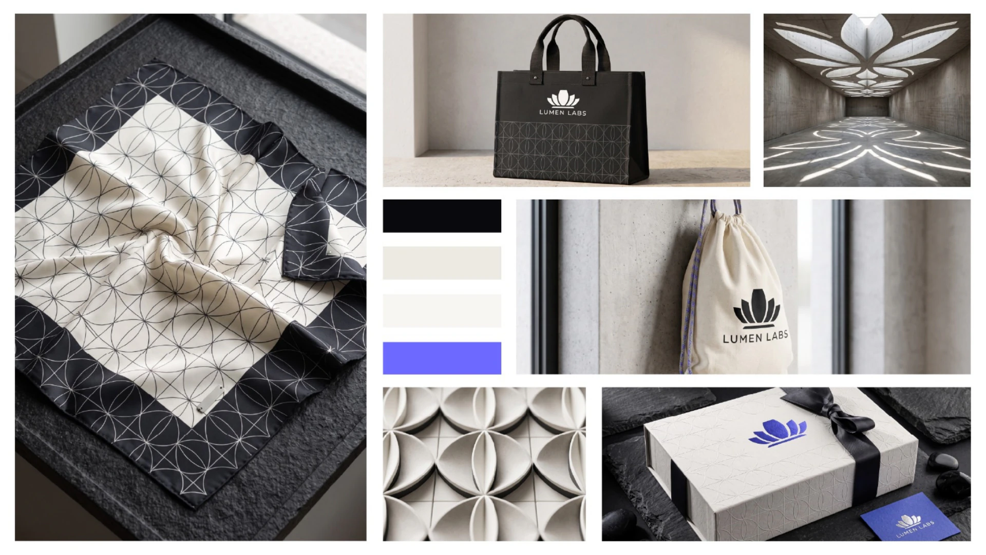
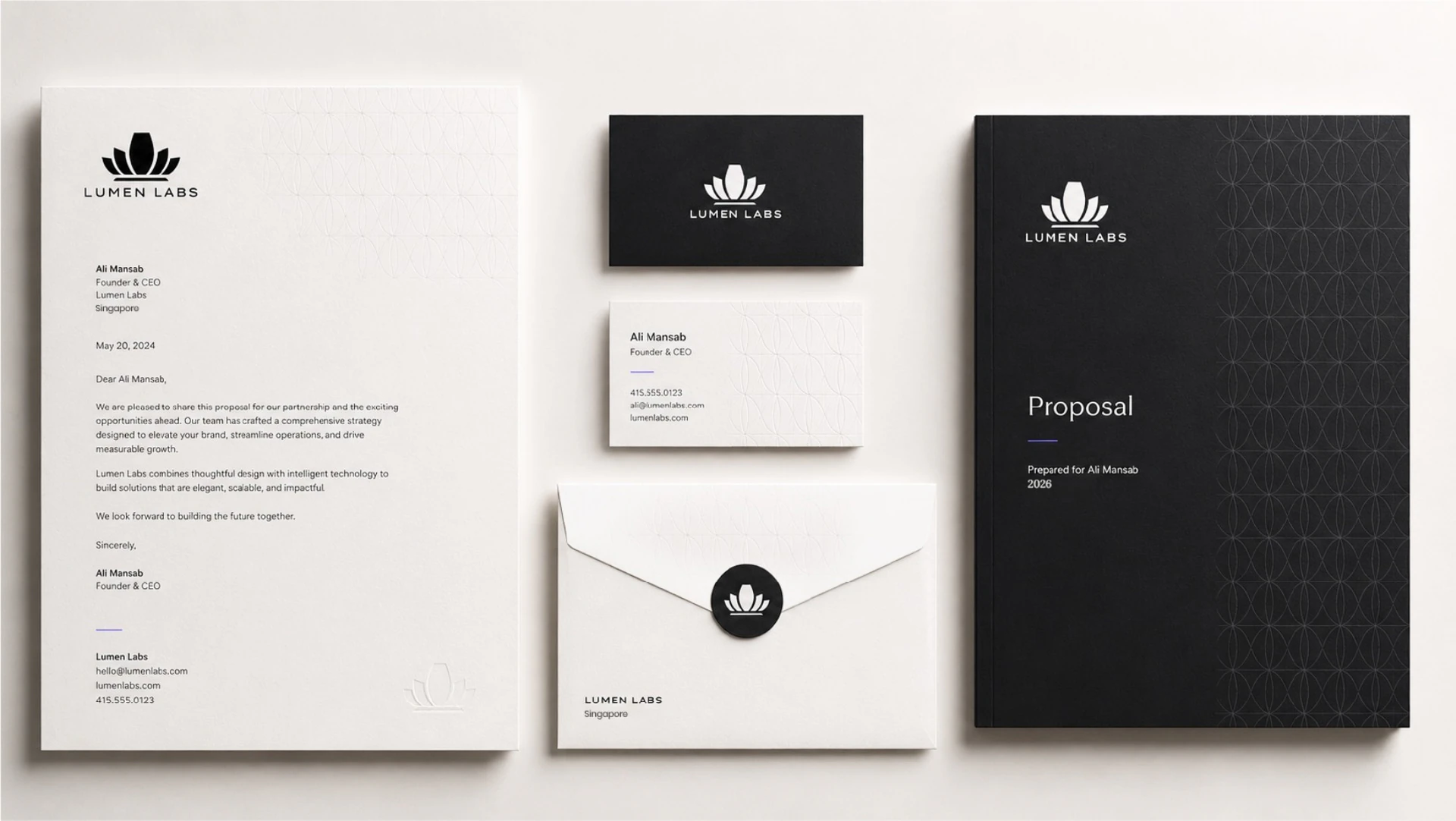
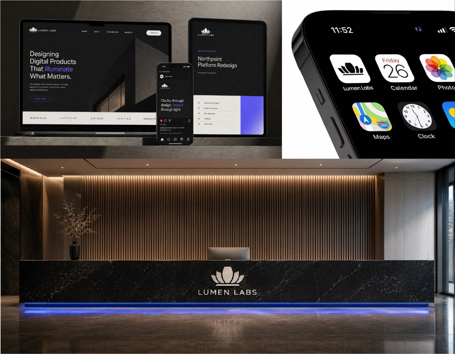
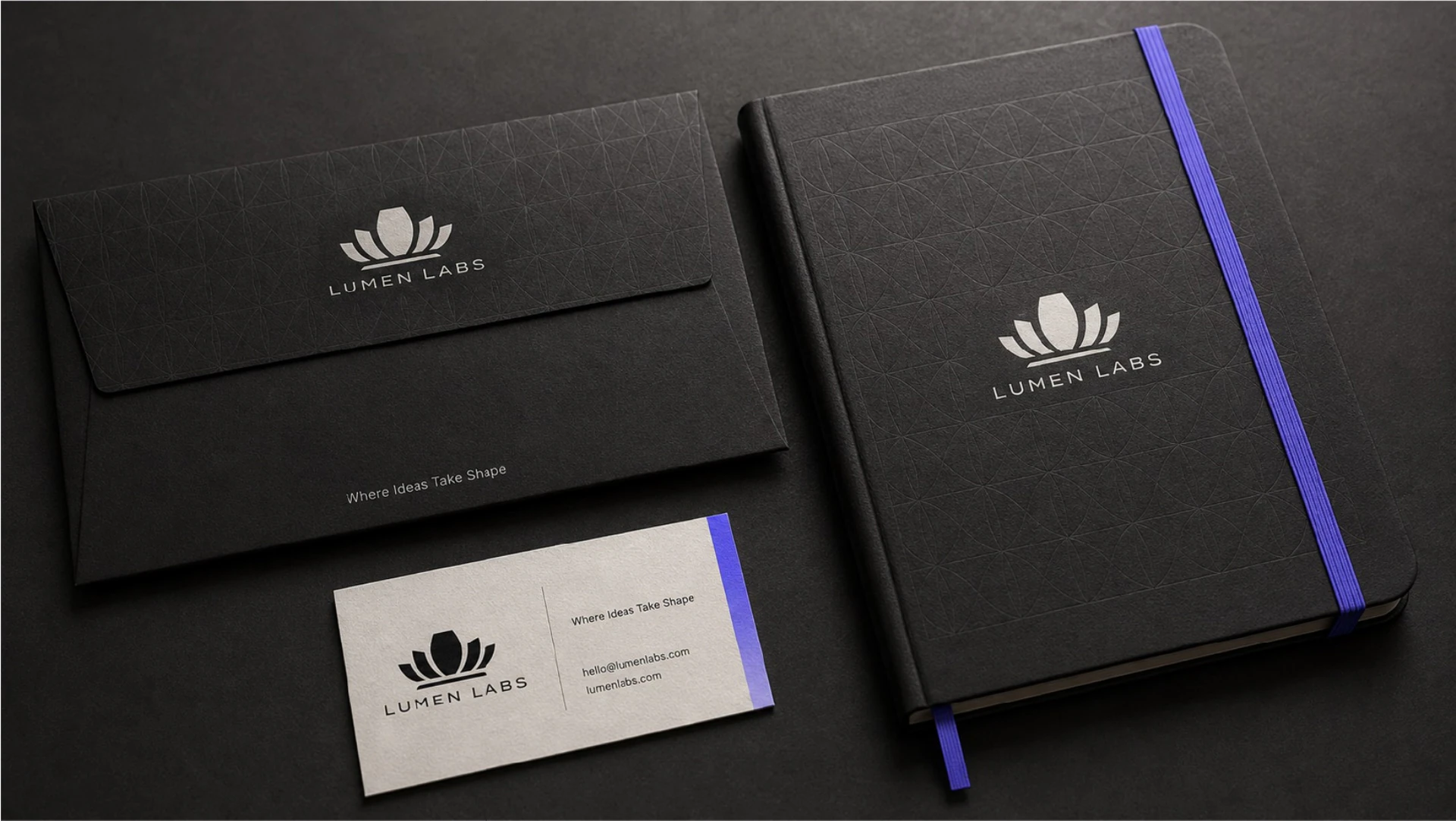
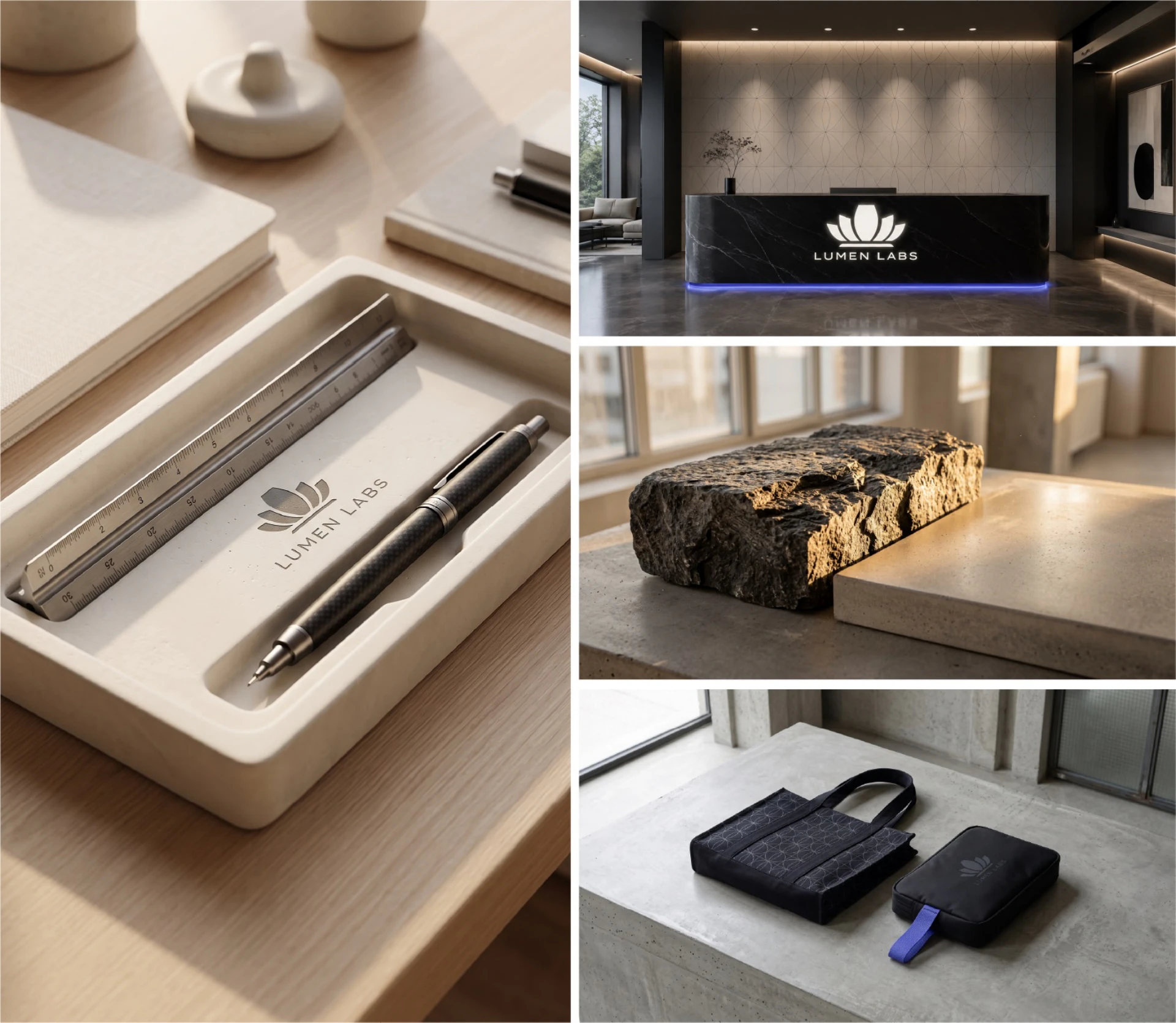
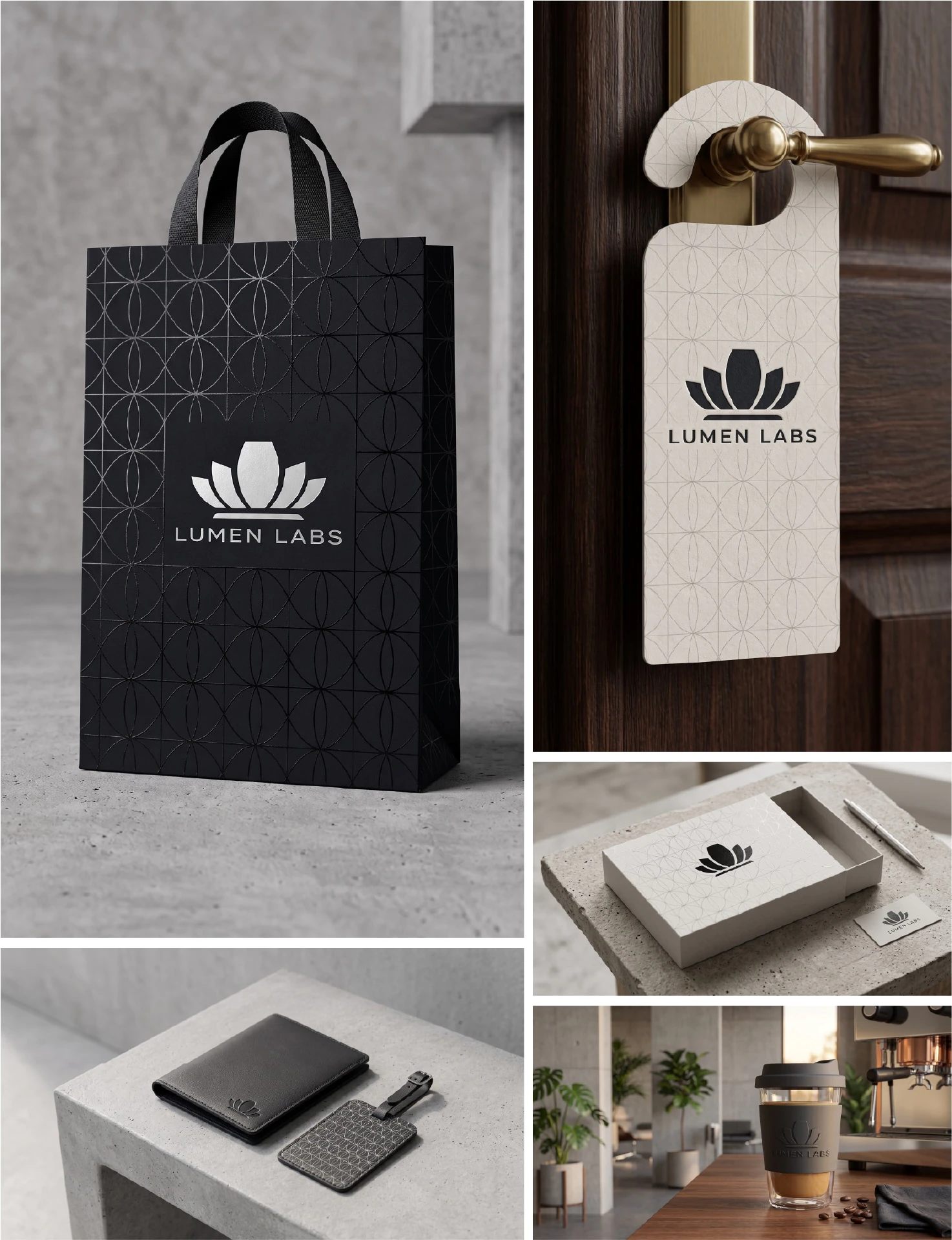
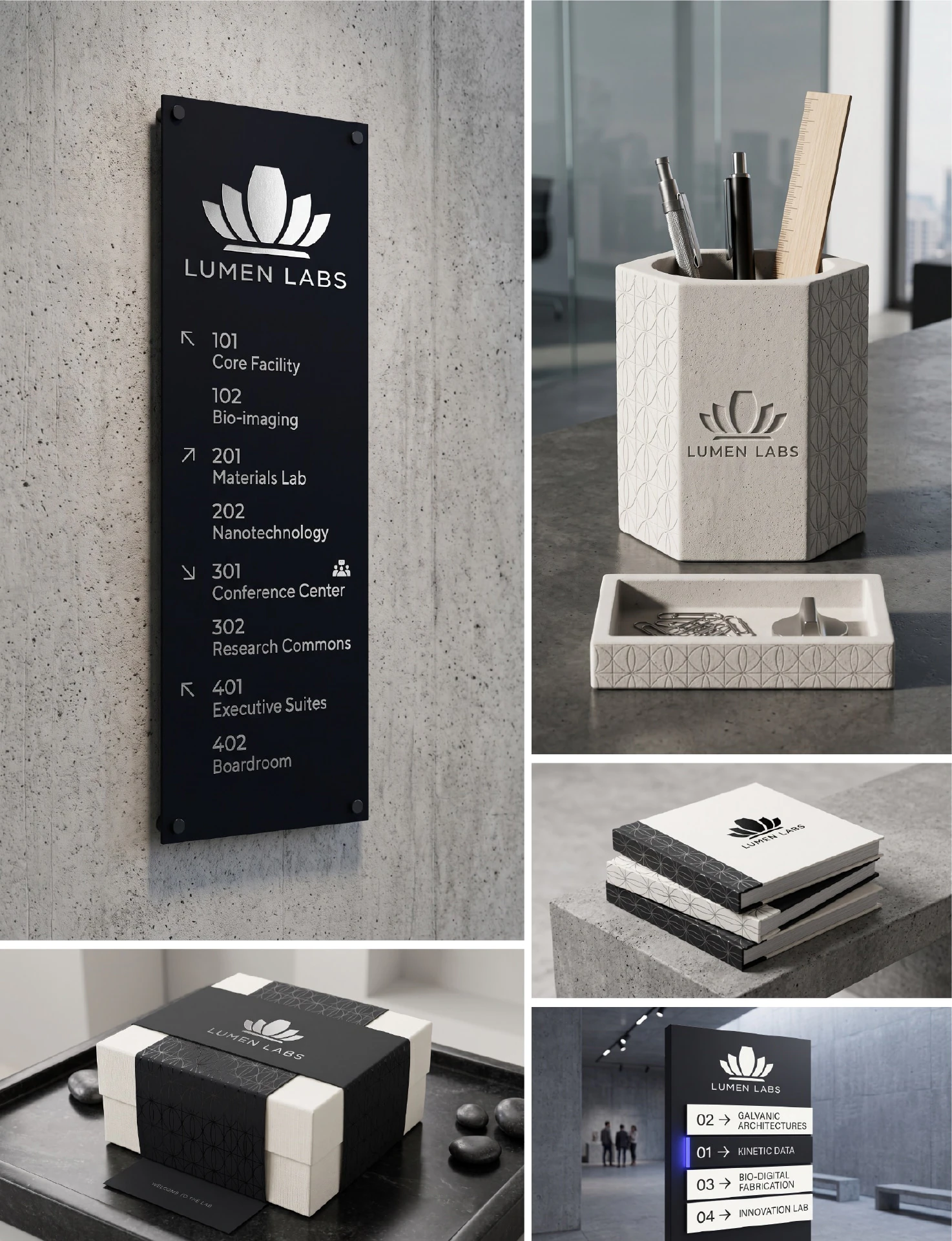
I gave the symbol room with a widely spaced uppercase wordmark. Near-black and warm off-white keep the identity grounded, while blue-violet adds a sharper note in details like a notebook band or a strip of light. A repeating line pattern carries the geometry into larger surfaces. The same visual language works at different scales, from a small app icon to glass signage and a patterned wall. The mockups below show what that looks like in practice.
Explore my branding and identity services.