
THE CREAT8VE JOURNAL · WEB DESIGN
5 Signs Your Business Website Needs a Redesign
Five signs your website is getting in the way of good inquiries, plus a practical way to decide whether it needs a refresh or a redesign.
Someone asks for your website, and you send the link with a disclaimer. “It’s a little out of date. Here’s what we actually do now.” That extra explanation is worth paying attention to. A referral who opens the same page on their own has to make sense of it without you.
Your business website may need a redesign when it describes an old offer, leaves buyers guessing, or makes a good inquiry harder to send. If the problem is one headline or one form, start there. When the same gaps show up across the homepage, service pages, case studies and contact flow, it’s worth planning a wider redesign.
1. Your website describes a business you’ve outgrown
Established service firms change gradually. You take on bigger engagements, narrow your specialty or replace a one-off service with ongoing support. Meanwhile, the homepage still gives equal space to everything you used to sell. A prospective client may miss the offer that makes your firm a good fit today.
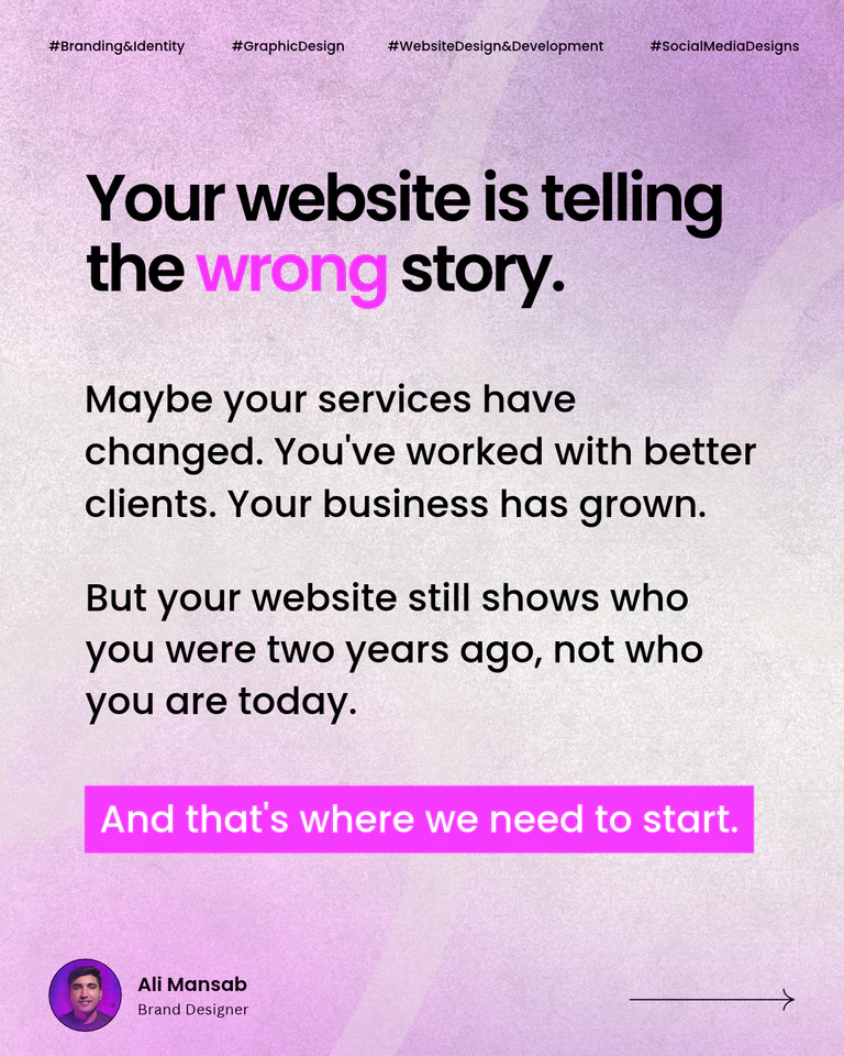
Check the mismatch. Put your homepage beside a recent proposal for the kind of work you want more of. Compare the audience, the main offer and the examples on both. A hypothetical operations consultancy that now leads with six-month support might still feature small setup projects on its homepage. Reordering the services and adding a relevant case study could make the current offer clear. If the navigation and most service pages still revolve around the old model, include them in the redesign.
2. A first-time visitor can’t tell what you do
Look at the first screen of your homepage on a phone. Could someone describe who you help and what they can hire you for? “Helping ambitious teams unlock their potential” could describe a coach, a hiring firm or a software tool. A clearer headline gives the rest of the page a job to do.
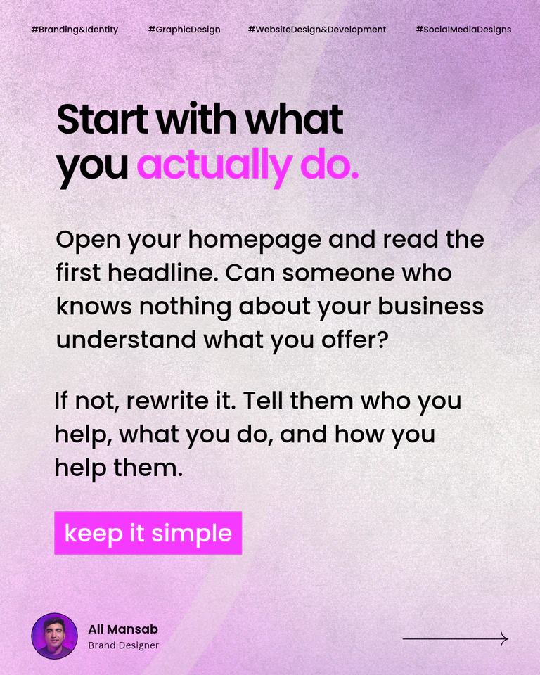
Try a plain-language version. A hypothetical consultancy could write, “We help growing professional services firms build a hiring process their managers can run.” Ask someone outside your business to read it once and explain the offer back to you. Put the clearest version on the homepage and check that the service page uses the same terms. Creat8ve’s article on branding myths for service businesses has an exercise for comparing what your homepage, proposal and welcome email promise.
3. The copy talks about your team before it answers the buyer
Your process and credentials can matter to a buyer. First, they need to recognize the situation that brought them to the page. A referral who needs help with a stalled project is likely looking for signs you handle that kind of work, what the engagement includes and when they can expect the first deliverable.
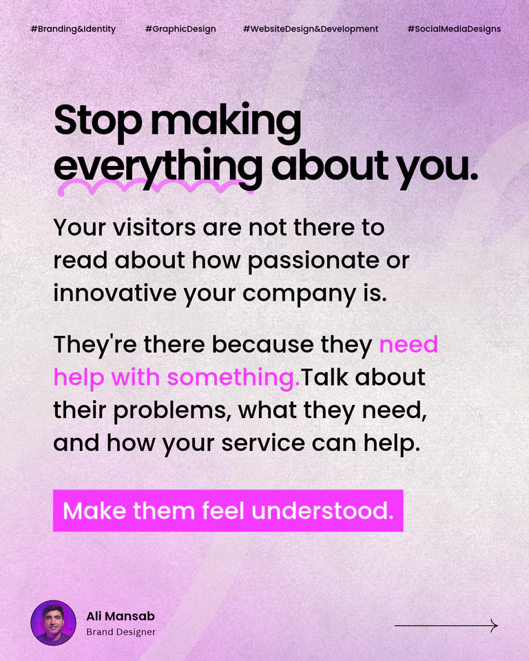
Start with real questions. Review recent discovery-call notes and look for the questions people ask before they commit. A hypothetical leadership coach might keep hearing, “Can you help newly promoted managers give difficult feedback?” That question belongs near the top of a relevant service page, alongside an explanation of what the sessions cover. Give the firm’s background a place where it helps answer why the buyer should trust you.
4. Your claims are hard to verify
“We deliver exceptional results” asks a buyer to take your word for it. A relevant project gives them more to evaluate. Explain the client’s situation, what you delivered and how the work addressed the brief. Use approved testimonials with enough context to make them meaningful. If a result is private or unmeasured, describe the deliverables and the decisions you can substantiate.
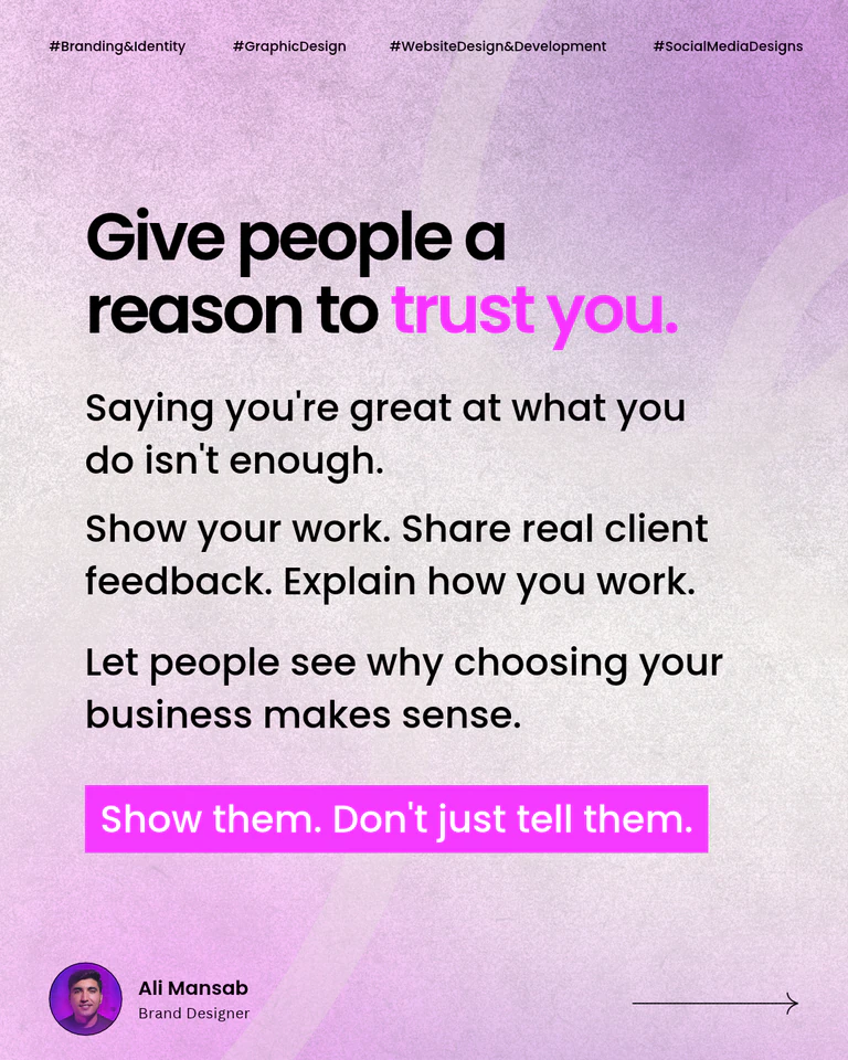
Put proof next to the offer. Link to a case study from the service it supports, where a buyer can see what working with you might involve. Creat8ve’s landing page project for Byron & Associates, for example, shows how the page was designed around the firm’s promotional offer and visual identity.
5. Interested buyers have to guess what to do next
Once someone decides you might be a fit, they need a clear way to take the next step. Vague labels, several competing buttons or a difficult form can make the choice harder. Start on a service page and try to send an inquiry on your phone. Check that the call to action describes what happens next and that the form gives clear feedback.
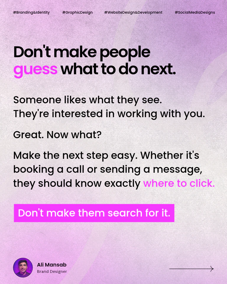
Test the entire path. If the next step is an inquiry, a button such as “Tell us about your project” sets an expectation. On the form, use visible labels, explain anything unfamiliar and keep required questions focused on what you need for a useful first reply. The W3C’s accessible forms tutorial covers labels, instructions and error feedback.
Should you refresh a few pages or redesign the site?
Follow one buyer journey from a referral link or search result to an inquiry. If you can solve the problem by rewriting a headline, adding proof or fixing the form, start with a targeted refresh. If the offer, navigation, service pages and contact flow need to change together, plan those changes as one project.
Before the work starts, record which pages bring relevant traffic or inquiries and which URLs are worth keeping. If a URL must change, map it to its closest new equivalent and follow Google’s guidance on site moves. If the site also feels slow on a phone, review Core Web Vitals and use available real-user data alongside a lab test to help narrow down what needs fixing.
If your website still describes the business you used to run, explore Creat8ve’s website design and development service. Bring the page you hesitate to share and a recent example of the work you want more of.
PASS IT ON
Share it on Social
5 Branding Myths That Could Be Costing You Clients
Five common branding mistakes and practical ways for service founders to clarify their offer, build trust and help the right clients choose them.
Brand Identity Checklist: Essential Guide for New Businesses
The essential identity elements every new business needs, from logos and typography to a consistent brand presence.